
Falling in Love with Scandinavian Design The Story behind the New Nokia Smartphones
Falling in Love with Scandinavian Design – the Story behind the New Nokia Smartphones
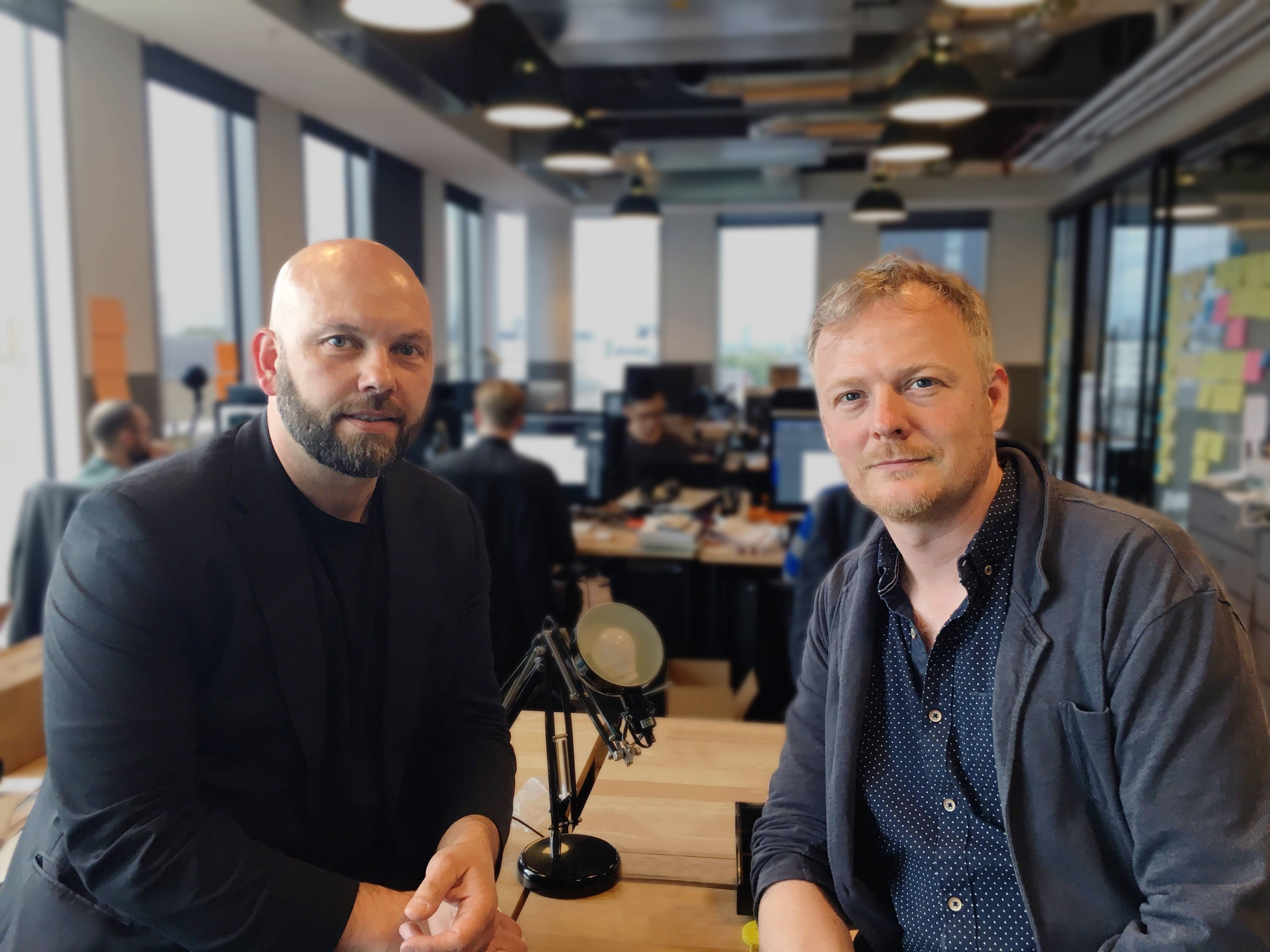
Raun Forsyth and Alasdair Mcphail, design directors at HMD Global, led the team behind the new Nokia smartphones – the Nokia 3, Nokia 5 and Nokia 6. Here they take us behind the scenes for an intimate look into the design process from start to finish, the principles of pure Scandinavian simplicity and functionality, staying true to the Nokia design heritage, and what it means to add purpose to beautiful design.
How does the creative process begin?
It all started with a strong team vision, we got together with one goal – to create something mind-blowing. As a newly established product team, we began by drawing on our intimate understanding of Nokia’s brand heritage and defining a solid common vision for what we are heading towards.
The goal was to deliver fantastically durable and smart devices that are at the same time so beautiful you fall in love with them. However, we believe that love develops over time. Whilst others try to trap your attention with shiny, over-the-top designs, we take a more understated approach. Our smartphones will not blind you, they will just keep delighting you as you use them until you end up in love, the gradual and undemanding process it should be.
What are your main design principles?
- Get the bones right first – a thorough understanding of the fundamentals of what you want to achieve. The design and engineering departments work separately in a lot of organisations but we work together. Phones have such intricate internals that you cannot design the exterior without understanding the functionality of each part. Otherwise, you will affect the performance. Take the antenna, for example. We have seen in the past how disappointing the user experience can be when design is the only driver behind repositioning it. So we worked with our experienced engineers to create a beautifully plain back panel by hiding the antenna lines on the edge of the phone without negatively impacting the performance.
- Scandinavian simplicity and purity as opposed to complexity – reducing the unnecessary. If you take away what’s not essential from a device, the features that remain are naturally better quality as there is more attention and space for them. Think about Formula 1 racing cars – the engine is now part of the chassis, it is all in one piece, reduced and simplified. And they have never been more powerful. Also, let’s be honest, the more superfluous parts you can remove, the less chance there is for quality issues. And by focussing on essential features, you can reduce the overall size of the smartphone too.
- Design with purpose. When deciding which materials to use for the chassis, we started by determining what qualities are most important to us and the Nokia users. We wanted phones which are solid, durable and feel good in the hand. Metal provides durability but piecing together separate parts to create a shell results in a higher risk of them breaking apart and disrupting the structural integrity – not something we were prepared to compromise on. So we invested in a metal unibody – each Nokia smartphone is carved from a single block of aluminium, a process which takes 12 hours per unit. And with the shell being made out of a solid metal block, we didn’t need to add a supporting structure inside to hold the parts together which reduced the space requirements and resulted in the compact size we were looking for.
- Excellence in visual mechanics. People buy on emotion. We can’t help but react to how the look of something makes us feel. That is why, often, beauty overrides logic – consumers are known to choose the aesthetically pleasing device over the supercomputer. It’s a hard-balancing act to fit performance into a shell designed in isolation, which is why we work from the outset with engineering, making it possible to bundle functionality and usability with a sleek and beautiful design. Once the bones of the structure are in the right place, we look at form and colours, the all-important visual side of things, to deliver the complete package.
You have chosen two very different product form factors, what was the logic behind the choices?
Not everyone has the same preferences when it comes to the size, weight, shape and colour of their smartphone. So instead of trying to get it almost right for the largest set of consumers, we decided to get it exactly right for everyone by creating a portfolio.
First, we focused on creating a natural, pebble-like, soft ergonomic form factor. It is a very human shape and although it takes a lot longer to manufacture than a flat line, we were determined to invest in it to trigger that emotive response we all have to natural objects. Emotions are not easily measurable and certainly not logical but it has taken us many years of experience in the industry to know what triggers them. And we are willing to break the rules and invest in those subtle features, like the pebble shape, which our customers may not even realise are there in the first instance. However, it is these features that will make them fall in love with their phones over time.
Then, we experimented with designing ergonomics that stop short from being completely rational – a shape that is ultra-cool, edgy and different. With sharp machined side walls that could kill, this design has attitude, it is not trying to be loved. The smartphone makes a strong statement to our customers who are looking for something meaningfully different.
How do you discover those irrational desires?
We conduct a lot of research. It is not about asking people to tell us what smartphone designs they want. We want to find out more about the other brands and products they like. Then we use our knowledge of consumer behaviour to draw our own conclusions on the common factors behind those affections and the emotive triggers they provide.
Talking about other brands and products, what did you draw your inspiration from?
Coming from our roots, we draw inspiration from the minimalism and simplicity of Scandinavian design and architecture. The most iconic object for us is the wavy glass vase by Scandinavian architect and designer Alvar Aalto. His pieces are simple but also memorable and confident in their uniqueness.
We also look at popular fashion. We noticed that copper, for example, is making a subtle comeback into houseware as part of the trend for natural metal colours to be incorporated into everyday fashion. The metal colours we are using are honest and natural, avoiding the bright cheap metals which could be perceived as Christmas decorations. Another colour we used was the colour of tempered steel – when heated to 600 degrees, steel turns a very deep, rich, silky blue. This colour also triggers pleasant familiarity from its resemblance to the dark denim and deep blue leather goods Italian fashion houses featured in their recent collections.
Any concluding remarks?
Things we are fighting for as designers are not logical, some of our choices may, to the untrained eye, look the same and cost more. However, those are the features which give a smartphone its emotional appeal. And we’ve learned when to break the rules. Even when phones sell, the design team often doesn’t get the kudos as people often assign the success to technical specifications. But it is easy to get bored by the spec race so it is time to give people real choice, and the only way to do that is through design.